From Partytiger to Quitiger — a lifechanging App
The Goal:
The Daily Health Conference is a non-profit organization that has been promoting health and wellness since 1983 through public talks, workshops, and training worldwide. Originally focused on Medicine, Health, and Wellness, the conference now covers a wide range of health topics in various languages.
However, despite its experience, the organization's membership has declined due to outdated technology. To provide more value, they aim to:
Develop mobile apps for members.
Revamp their image with a modern design system that embodies an innovative wellbeing approach.
The Problem:
Urban dwellers in their 30s dependent on substances need to find a way to break their habits and improve their mental, physical and financial wellbeing because they are psychologically dependent, lack motivation and are subject to social pressure.
The Solution:
An app that supports users on their path to becoming sober by creating a customized plan for quitting, coupled with a strong community focus that connects users with like-minded people on a similar path to quitting.
Empathize:
Research
To better understand the situation, we have launched a survey on social networks. Among other things, we wanted to know what and how often people use nicotine and whether they have already tried to quit, or what was their motivation behind it.
With over 100 responses, we were able to get a good picture.
Competitor Analysis
To get a picture of what apps are available on the market we compared different apps. These included Smoke Free, I am Sober, Quit Now, Grounded and Kwit. We noticed that most of the apps are only geared towards one addiction and that the prices are also adapted to the scope of the apps. Also noticeable is that two Apps to quit smoking are the most downloaded.
As part of our analysis, we conducted a thorough comparison of our competitors' features. One noteworthy observation is that all of them provide community support and rewards & achievements. We'll take this information into account as we proceed with our analysis and design process.
Affinity Diagram & Empathy Map
We conducted a comprehensive analysis of our interview transcripts and survey responses, consolidating all valuable quotes and insights into a cohesive collection. After organizing the data into distinct clusters, we identified four primary themes: 'Helpful during Quitting,' 'Motivators,' 'Struggles,' and 'App Features.' Utilizing the dot voting method, we determined to prioritize the themes 'Helpful during Quitting' and 'Struggles' as we move forward with our design process.
Through the development of an empathy map, we gained valuable insights into the user's behavior and identified key trends among the respondents. These findings deepened our understanding of our target audience and how we can provide optimal assistance to them. By uncovering these user patterns, we were able to validate or invalidate certain theories and assumptions that we had during the initial research phase.
Define:
User Persona
But let’s dive deeper! Based on the collected data, we create our user persona: Demotivated Daniel – British, 31 customer experience agent living in Berlin with his Girlfriend.
He lives by the motto work hard, play hard, but unfortunately it is taking its toll on him, it’s starting to feel like a crutch. His social life revolves around substance use — drinks, ciggies, illicit drugs, weed. He knows he needs a change, but doesn’t know how to implement this change.
Daniel has come to the realization that he cannot sustain his current lifestyle any longer. Although he has some social support, his motivation is at its lowest point. Nevertheless, Daniel is determined to overcome his substance dependency and enhance both his mental and physical well-being. A significant motivating factor for him is the desire to save money.
Ideate:
Moscow Method:
After analyzing the extensive data we collected and creating a comprehensive user profile of Daniel, we generated a range of ideas for our app. Through this process, we identified and categorized features into must-haves, should-haves, could-haves, and won't-haves.
After applying the Moscow Method, we have formulated an MVP statement, which essentially serves as our app's one-liner pitch, clearly conveying its purpose and core functionalities. Additionally, it acts as a constant reminder throughout the ideation stage, guiding us to focus on developing the essential features.
An app that supports users on their journey to give up substances through a highly customized quitting plan, integrated with a strong community focus that connects users with likeminded people on a similar quitting journey.
Protoyping & Testing, Testing, Testing
Low-Fidelity
I find immense excitement in visualizing information, ideas, and concepts. Our journey began with initial sketches, outlining the rough screen layouts and brainstorming potential names, eventually leading us to 'Caterquitter.'
Through user testing and feedback, we evolved from Caterquitter to 'Quittiger,' refining our designs into mid-fi prototypes. We created a mood board, defining the app's attributes as 'Powerful, Stimulating, Connected, Helpful, and Motivating,' which guided our color palette and typography choices.
Furthermore, we defined the user data we aim to offer, ensuring a concrete direction for our app's development.
Brand Attributes & Branding
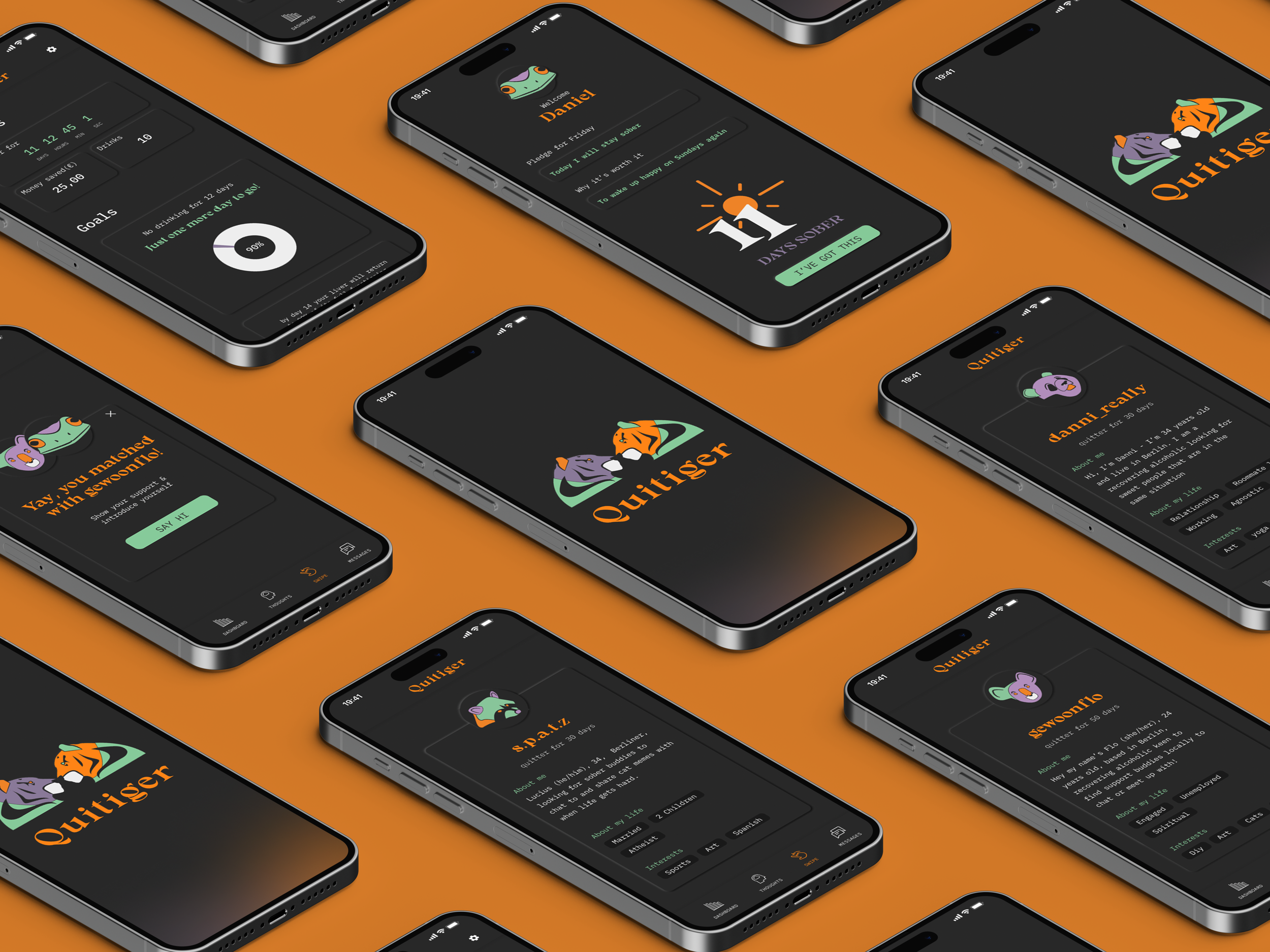
Quitiger, obviously a play on words from Quit and Tiger. Why the tiger? The tiger is a fighter, just like our users, who want to attack and defeat their addictions in the urban jungle.
The tiger is a loner, but can join forces with other tigers to achieve his goals. Perfect, then, for our User, who wants to beat their addictions, but get support to do so.
The color scheme of the app is somber, based on the hole you're in the circle of addiction. However, the logo and the user's avatar stand out from the darkness and exude confidence and fighting spirit. The logo is mirrored to represent the important part of the process of reflection, but can also be interpreted as entering into dialogue with another user.
Colors were chosen here that create a unique combination and result in a very appealing color branding that creates a high recognition value. It also appeals to our target audience in their 30s, as it looks poppy and modern and stands out strongly from the competition.
With that said, our final attributes are: Powerful · Stimulating · Connected · Helpful · Motivating
We conducted extensive attribute testing with a large number of users and achieved multiple matches. To ensure the utmost accuracy in our results, we utilized the Microsoft Reaction Cards.
Mid-Fidelity
Our key objective was to foster a strong sense of community among users, highlighting that their journey to sobriety need not be a solitary one. Visually showcasing the benefits discovered through interviews and surveys, such as rapid improvements in physical and mental well-being, as well as cost savings, was another focal point.
We conducted extensive tests on our Swipe function, designed to facilitate connections with 'Soberbuddys' for discussions, mutual support, and motivation. The swipe feature, reminiscent of popular dating apps, allows users to swipe left to pass on a person and swipe right to connect.
After receiving feedback from Mid-Fi wireframes, we implemented a concise introduction to enhance the user experience, yielding positive responses during testing.
In recognition of the sensitivity surrounding the topic, we offered users a selection of avatars, following our Quitiger theme, to ensure privacy while interacting with the app.
Based on the feedback received during testing, we identified areas for improvement: some users found the 'Pledge' feature confusing, and there were issues with clarity surrounding the swipe function. Additionally, the name 'Caterquitter' was not well-received.
High-Fidelity
Now we've reached the high-fidelity prototype stage, where we focus on intricate details. As showcased in the video, our design incorporates numerous small animations to enhance user engagement and create a stimulating experience, keeping users immersed within the app.
The dashboard offers an array of informative data about the user's current sobriety journey, including progress made in the body's recovery and the amount of money saved.
Personalization is a key aspect of the user profile, allowing users to customize various elements to tailor the dashboard to their individual preferences.
I proudly present the full-fledged swipe function, demonstrating the seamless process of connecting with a 'Soberbuddy.' Once connected, users can initiate communication and interact.
In the following video, you can see the app in action. As the attention span of our target audience is decreasing, we have used many animations and interactions, such as sliders and carousels. You can also see the swipe function and successful matching.
Accessibility
As you've observed, we've diligently incorporated multiple screen states to provide a comprehensive overview of our app's functionality.
During our discussions and reviews, we prioritized accessibility, aiming for AA compliance across our app. We recognize the potential for further improvement in this area and are committed to enhancing accessibility in the future.
Future Plans
Next Steps
This app holds significant potential, considering the manageable market size and the existing apps that address addiction-related concerns, although not comprehensively. Many of these existing apps feature somewhat outdated designs that might not resonate with a younger demographic, especially those grappling with the prevalent issues of drug and alcohol accessibility in our society
Offer the option for a light mode as well
Include a craving analyser
Code/Face id as a security setting
Content and education section
In-app games to help you keep distracted
Get messages and videos from friends or family that support you during your quitting journey. Whenever you’re feeling low, you can reveal a new message to help you keep courageous
Function for family / relatives living with an addict
Final Words:
What i learnt:
I learnt how open users can be about sensitive topics like this to help you help other people which was a great experience. Also I learnt about how crucial user testing is while prototyping. Many features that I thought would be intuitive to use needed more assistance, like the swipe function where I later added small moving hands that imitate the gesture of the swiping.
Finally, I hope that you enjoyed our app. It was a very interesting topic that also encourages you to question yourself more often.
This project was very close to my heart because addiction is a huge issue in today's society. Many young people are already struggling with it because drugs and alcohol are accepted in society and glorified on social media.
Also, in my everyday life in Berlin, I see so many people struggling with different addictions and often you ask yourself the question, "What if?"
What if, these people had used our app or gotten help earlier?
If you have any feedback, questions or comments, feel free to email me or on this website using the contact form.
Also, I would be happy if we connect on Linkedin.
Thank you for your time!
Date:
May 2023
2 Weeks
My Role:
UX/UI Design, Research, Branding, Wireframing, Prototyping
Team:
Danni, Flo, Me (Guided by Ironhack UI/UX Bootcamp)
Deliverables:
Mobile App Prototype
